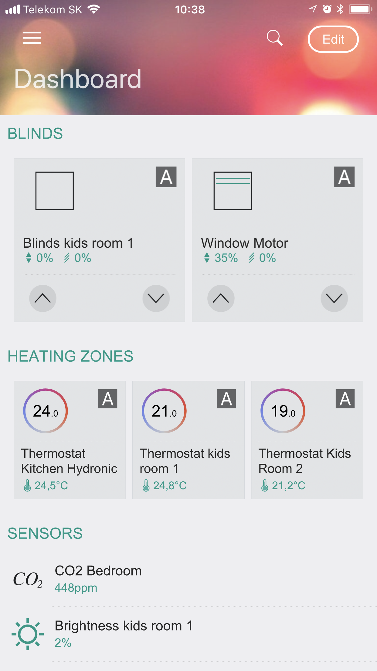
Dashboards allow you to organize favorite items such as a heating/cooling zone, a specific blind, or a lighting scene. It is possible to create multiple dashboards, which is useful for large projects—for example, each facade of an office building can have its own dashboard. Information panels are stored in Core and are loaded from it after reinstalling the application.
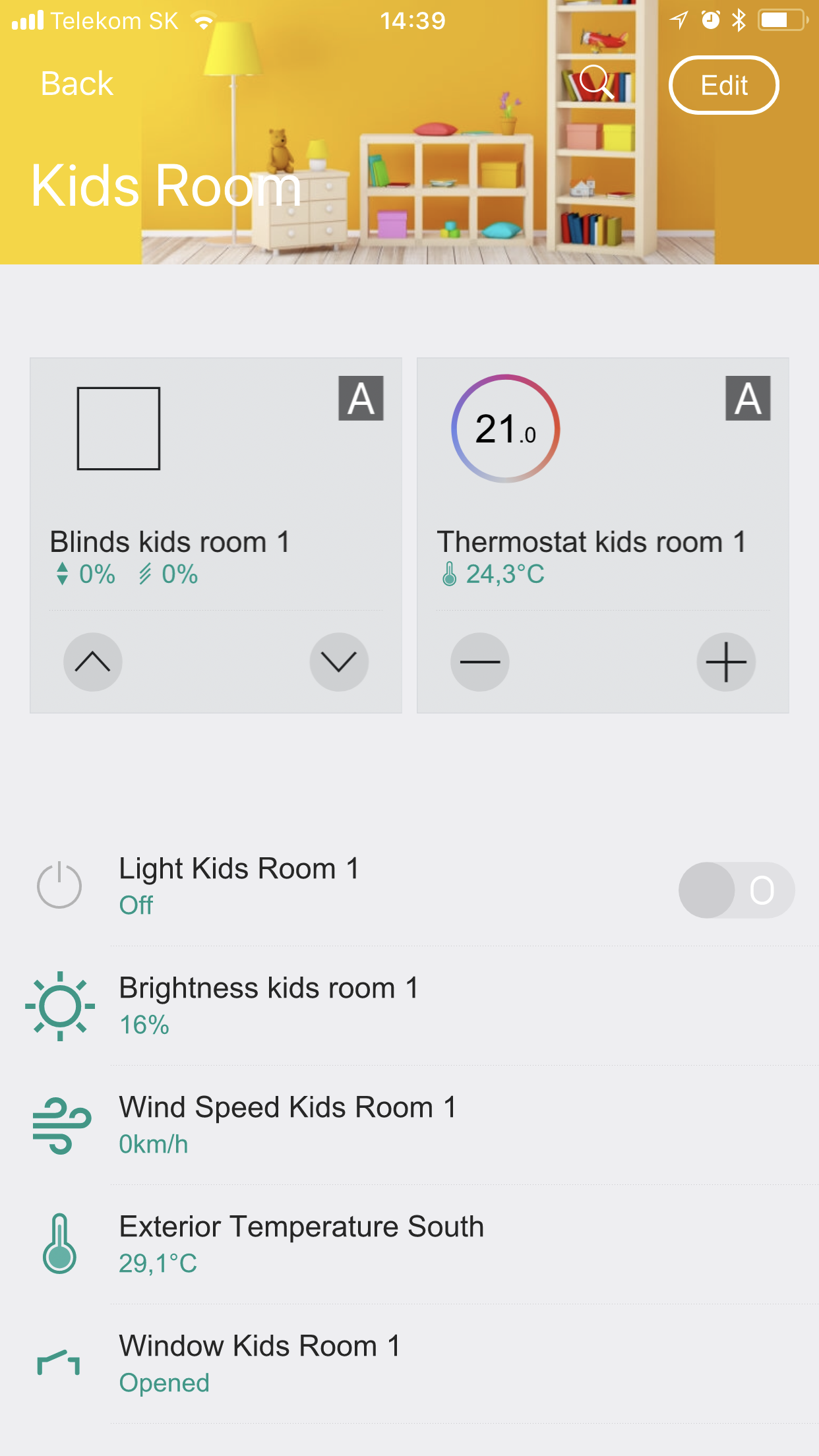
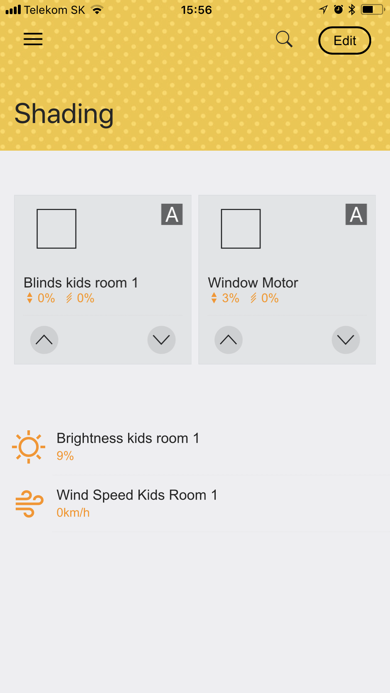
Zones represent rooms, offices, and halls. Categories are functional areas such as heating, cooling, or shading.
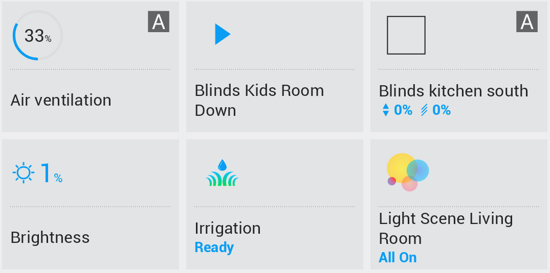
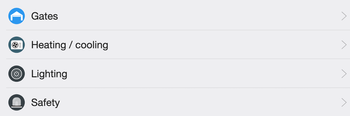
Display examples
Customizing dashboards, zones, and categories
Open the specific page and click the Edit button in the upper-right corner. In edit mode, you can:
- Customize content by adding or removing sections
- Change the order of sections
- Edit the content and type of sections
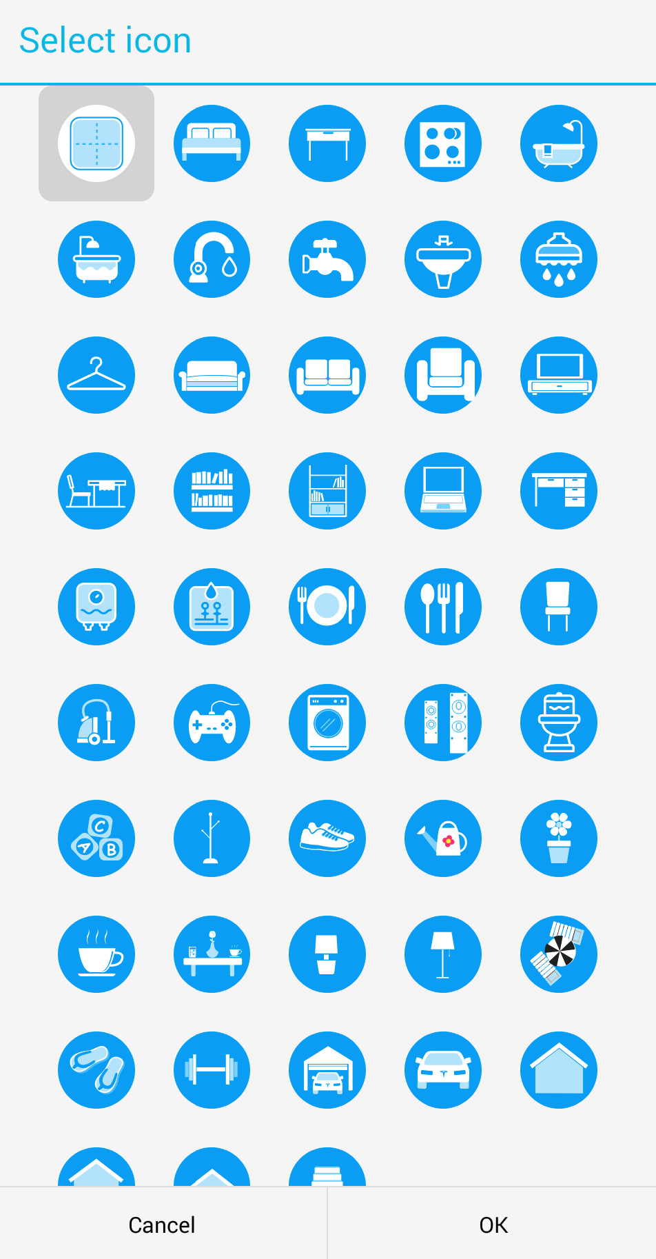
- Customize the icon
- Change the background image
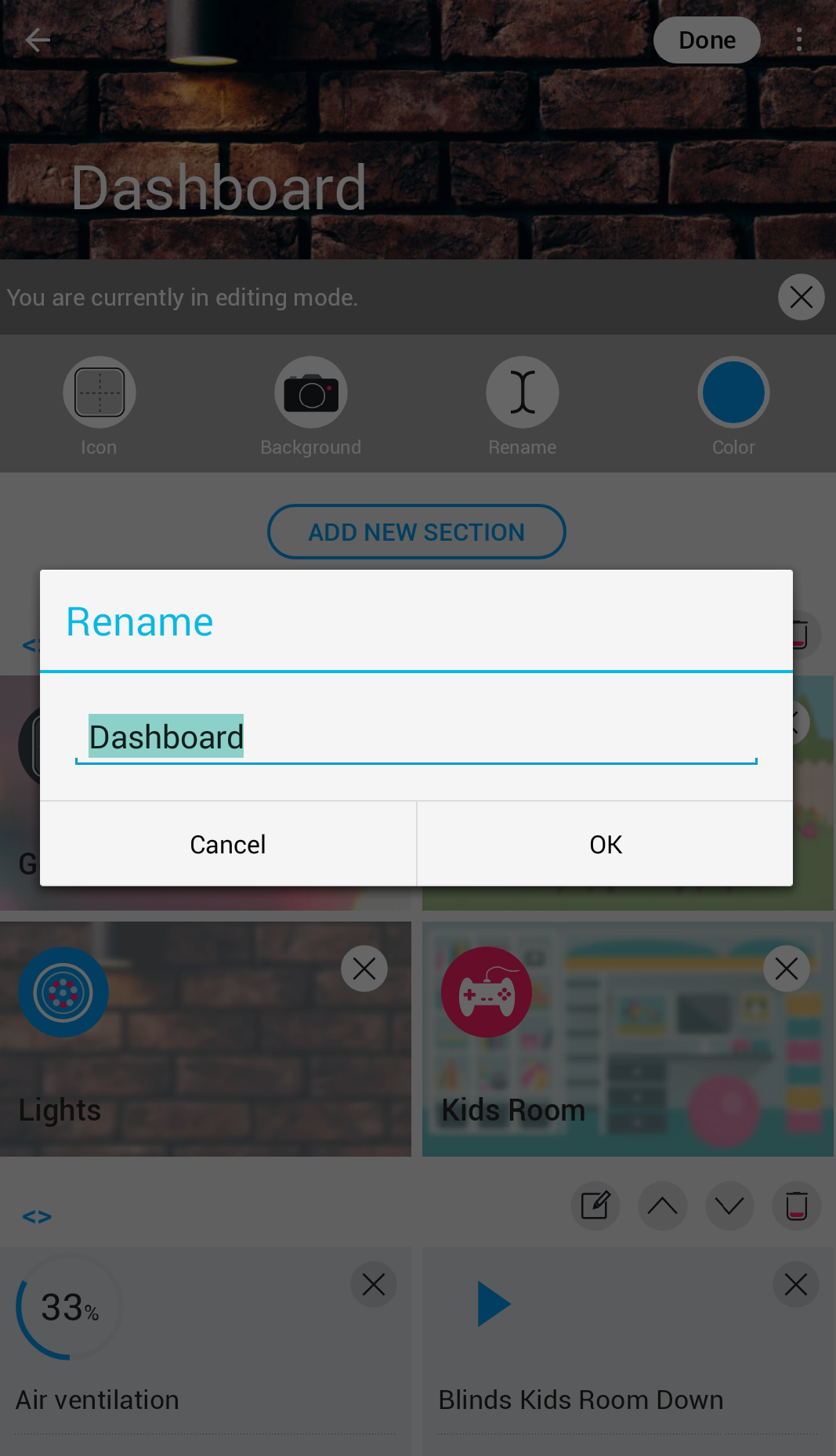
- Rename the dashboard, zone, or category
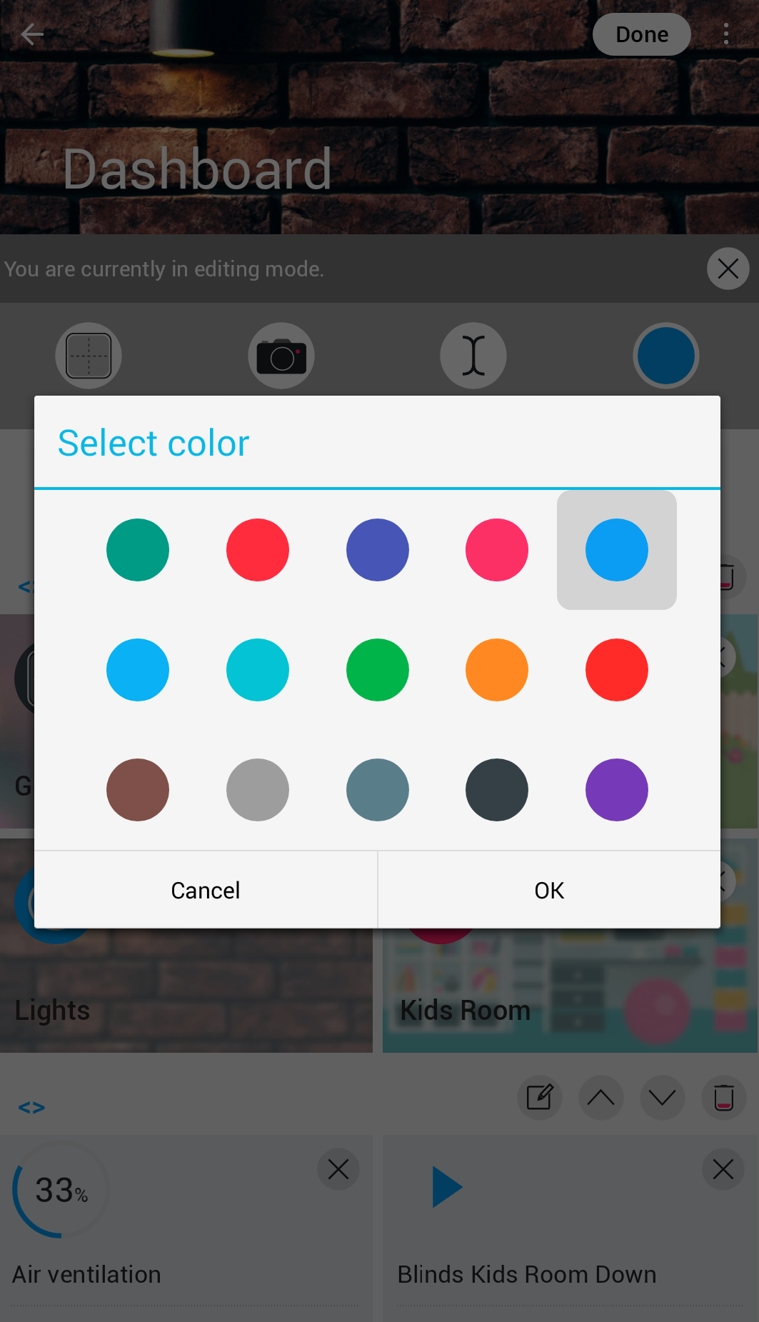
- Customize the accent color
Editing properties
In edit mode, you have these customization options:
Select an icon that best represents your dashboard, zone, or category:
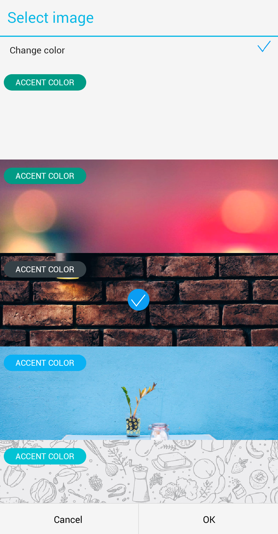
Change the background or color theme. You can choose from a predefined gallery of images or upload your own image from your device.
Rename your Dashboard , zone, or category as needed:
Set the accent color for highlighting:
Types of sections
Devices
Devices can be displayed in three different formats:
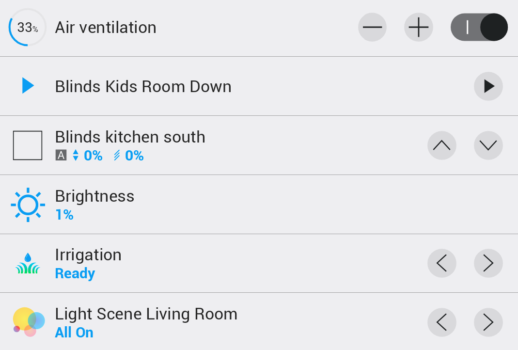
The standard list view displays devices compactly one below another.
The expanded view with details shows each device in a large card.
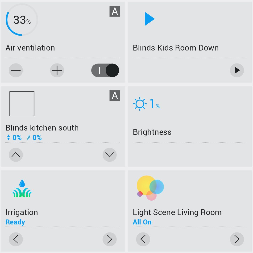
A compact view displays devices in a grid of small widgets.
Shortcuts
Shortcuts can be displayed in two formats:
The standard list format displays shortcuts compactly one below another.
The expanded format displays shortcuts as large cards with a background.
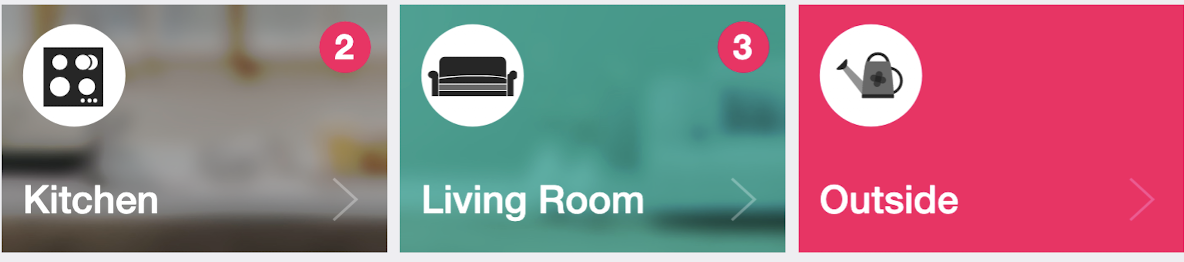
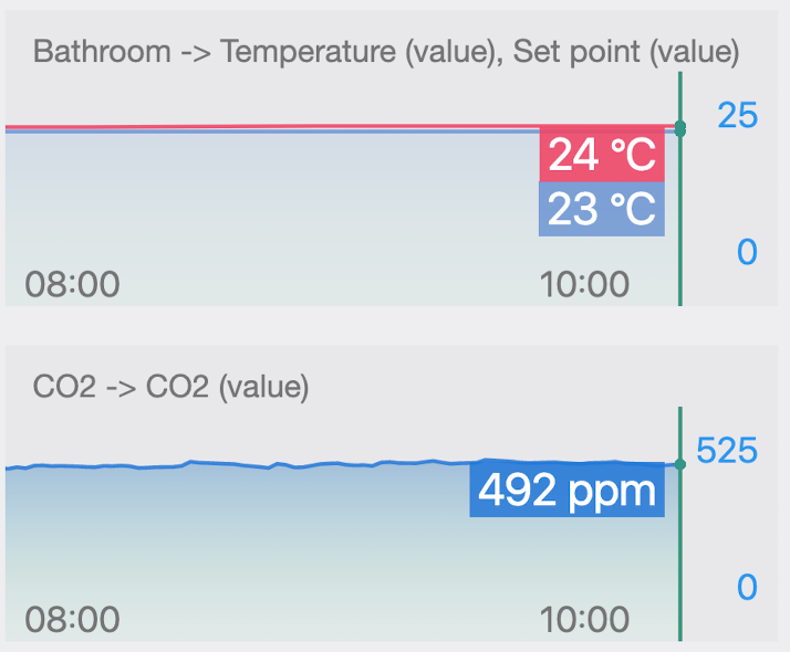
Chart section
Chart sections display historical data and trends for your devices. There are three sizes available:
A compact chart suitable for a quick overview of data.
A medium chart with more space for data visualization.
A large chart with a detailed display and maximum space for data analysis.
All charts within a single section share zooming and horizontal scrolling of the time axis. This makes it easy to analyze the entire data set.
Predvolený obsah
In the default configuration, the following sections are automatically generated:
- Dashboard : one section with small widgets
- Zone: sections grouped by categories. Sections of favorite categories consist of small widgets, while sections of other categories use a list
- Category: sections grouped by zones. Sections of favorite zones consist of small widgets, while sections of other zones use a list
Customizing content
All elements can be freely customized:
- Change the order of sections – drag sections according to your preferences
- Hide devices – remove devices you do not want to display
- Delete sections – remove entire sections if you do not need them
- Add new sections – create your own arrangement
- Combine display types – use different display types in different sections